Donation Page Examples to Inspire Your Online Fundraising
Creating an effective donation page design is crucial for bringing in more donations. If you’re looking for donation page examples and tips to boost your donation activities, you have landed at the right place.
With an increased reach of media and awareness, people are becoming more sensitive towards global issues. The values of sustainability, saving endangered species, reducing animal cruelty, stopping crimes against minority groups, and supporting natural and manmade calamities are increasing daily. With this, the scenario has improved for genuine Non-profit organizations to organize online fundraising campaigns.
However, without an effective donation page design or a well-designed form, you will be stuck. This blog caters to various considerations for designing a donation page and gives you practical tips. We will also look at some of the most effective non-profit donation page examples and learn from the best.

A donation page is the center, the heart of a fundraising organization. It is a landing page with an embedded donation form to drive users on a guided journey. Donation Pages for fundraising provide information about the organization and give a gateway to donate. It clearly states the mission, vision, and utility of receiving online fundraising from people. A donation page is not a shopping or transaction page. It evokes emotion, generosity, drives attention toward a world problem, and expresses the need to gather money for a cause.
Do you know there are around 31% of donors who pay an NGO outside their country? Further, the donation amounts have been as high as $500 billion by just Americans. So, you know there are people who would genuinely want to contribute to a good cause. If you have one, make sure it reaches the mass and attracts them with the following pointers.
What makes donation pages successful? Well, a donation page is not about looking good but building trust. An online fundraising page must consider the following pointers to reflect its motto and values.
Everyone might not be aware of who you are and what you do. Thus, a strong brand presence with the help of logos and brand colors will help build trust in your fundraising initiatives.

You can add a brief paragraph explaining the Why of your fundraising activities. The questions to answer while writing this are as follows.
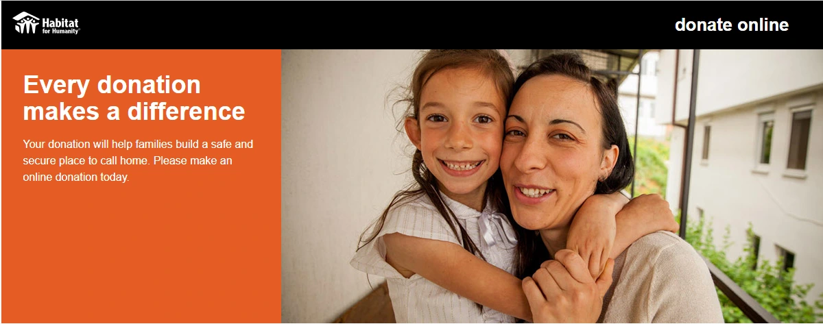
In this donation page example, they clearly state that the money will help build families a safe space to live in a very crisp way.

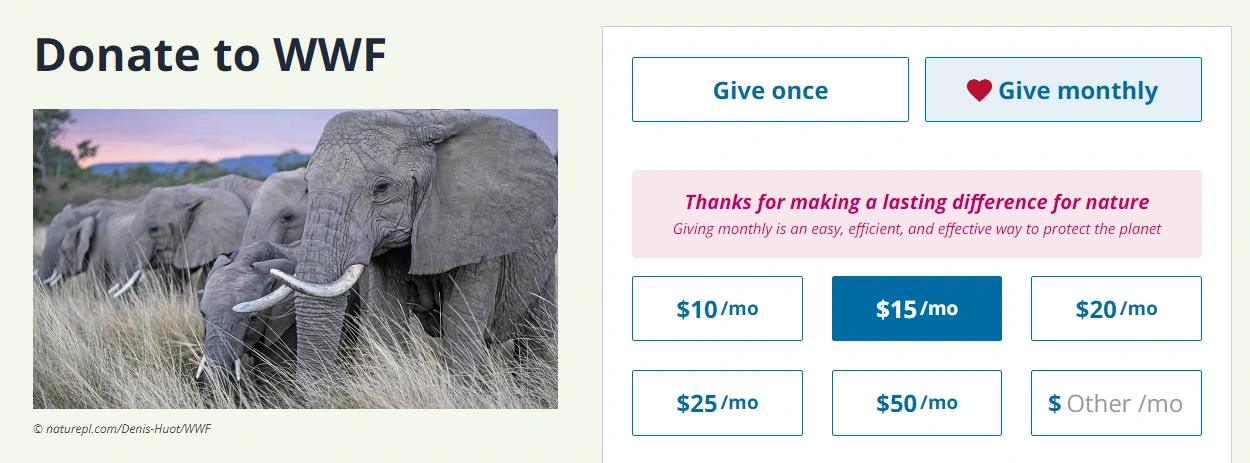
When you just put a custom amount box on your donation page, the viewers will be confused. They will be stuck on what to give, how much to give, and whether this amount is okay or not. You must provide easy options to donate by suggesting amounts on your page. Make sure you are providing the amount in all ranges. Low, Mid, and High. This will give a better idea and ease audience confusion.
For example, start from $5, $20, $50, $100 and so on. Now, it will be easier for donors to pick an amount or custom to think of an amount as they know any small or big amount is welcome. Further, provide an option for one-time donations or let them opt for recurring donations.

When you’re transparent, you build the most loyal audience. Reflect on how each donation is used and invested. Have a separate page linked to the main donation page that provides utility details. If you want an answer to what makes donation pages successful, it’s transparency. Have an open statement or have the facility to request a statement at any time.

If you are having regular meetups for donors, online fundraising campaigns, or events to showcase the result of donations, then have it on your event list. With this, the donors would know how they can be involved further with your organization. This is to show them the value you have for your donors.
Let’s be honest and practical. Many people would donate to Nonprofits only because it will help them with tax deductions. In the U.S., donations to non-profit organizations coming under 501(c)(3) are tax-deductible. This increases the willingness to donate among many citizens. Highlight the tax benefits and the amount at which a user can receive such benefits. Having a tax-effective design increases motivation in one-time as well as recurring payers.
Add details on providing receipts for tax purposes. You can also offer an in-built calculator so that donors can calculate and estimate their tax savings based on the donation amount. This will attract high-net-worth individuals and giant corporations.
You can opt for a donation platform like doublethedonation, donorbox, Wild Apricot or create your own donation page. If you are running a website, you can simply create a donation form with the help of the ARForms plugin. It comes with built-in payment gateways and a pop-up builder. The live editor with an intuitive drag-and-drop builder eases your form creation tasks. Choose from multiple templates and get going quickly. You can even find multiple donation page templates online to reuse.
We shall now look at some of the exclusive fundraising landing page examples. These inspiring donation page examples will help you kickstart your page design effectively.
Whether you are running an NGO membership website or an organizational website, you must consider these points before designing. And did you know there’s one more important thing? Having all your important information in just one fold. That means, having the most crucial information on a single screen so that it is visible without needing to scroll. This will enhance the user experience seamlessly.
Take inspiration from the list of NGOs and observe the way they’ve put information. You do not need to have it all but find your box of perfection to go ahead.
Read These also:
With an increased reach of media and awareness, people are becoming more sensitive towards global issues. The values of sustainability, saving endangered species, reducing animal cruelty, stopping crimes against minority groups, and supporting natural and manmade calamities are increasing daily. With this, the scenario has improved for genuine Non-profit organizations to organize online fundraising campaigns.
However, without an effective donation page design or a well-designed form, you will be stuck. This blog caters to various considerations for designing a donation page and gives you practical tips. We will also look at some of the most effective non-profit donation page examples and learn from the best.
What is a Donation Page
A donation page is the center, the heart of a fundraising organization. It is a landing page with an embedded donation form to drive users on a guided journey. Donation Pages for fundraising provide information about the organization and give a gateway to donate. It clearly states the mission, vision, and utility of receiving online fundraising from people. A donation page is not a shopping or transaction page. It evokes emotion, generosity, drives attention toward a world problem, and expresses the need to gather money for a cause.
Do you know there are around 31% of donors who pay an NGO outside their country? Further, the donation amounts have been as high as $500 billion by just Americans. So, you know there are people who would genuinely want to contribute to a good cause. If you have one, make sure it reaches the mass and attracts them with the following pointers.
Essentials for Online Fundraising Form
What makes donation pages successful? Well, a donation page is not about looking good but building trust. An online fundraising page must consider the following pointers to reflect its motto and values.
1. Brand Logo
The donation pages must reflect your brand logo and brand identity. Not everyone will directly land on your website. The traffic comes from various sources including social media, paid ads, social shares, email marketing, and so on.Everyone might not be aware of who you are and what you do. Thus, a strong brand presence with the help of logos and brand colors will help build trust in your fundraising initiatives.
2. Headline or Title
A page headline or title must be the reflection of your goal. It should highlight the benefactors of the donation and specify how you are helping them. Here are a few examples of such headlines:- Donate to Improve the Lives of Slum Dwellers
- Help Provide Clean Water to 1000 Families in Drought Area
- Educate an underprivileged child with every donation
- Assist in Providing Mid Day Meals for Government Schools
- Help Save Chickens from Being Mass Murdered
- Lend a Hand to Save Innocents of the Terrorist Attack
3.Secure Link
Make your website and donation page link secure by getting an SSL certificate. People are now aware of multiple scams and cyber frauds. Without a proper URL and secure redirection, you will have very limited conversions. Take the help of a tech expert and understand how you can optimize your URL and keep your site secure.4. The Motto or The Why
You can add a brief paragraph explaining the Why of your fundraising activities. The questions to answer while writing this are as follows.
- Who are you?
- Why and How are you involved in this fundraising?
- What’s your inspiration?
- Who are your benefactors?
- How is the donated money utilized?
In this donation page example, they clearly state that the money will help build families a safe space to live in a very crisp way.
5. Responsive Design
Your donation form and landing page design must be responsive on multiple devices. Nearly 60% of Global web page views come from mobile devices. Thus, you must optimize your copy and design elements to suit accordingly. There must be no confusion while navigating and donating to your NGO from any device.6. Amount Suggestions with Custom Field
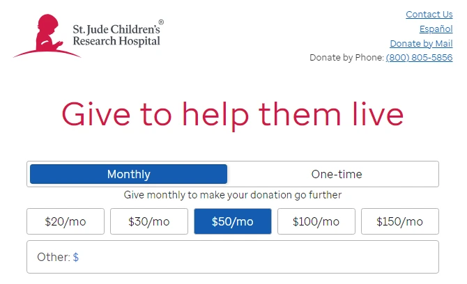
When you just put a custom amount box on your donation page, the viewers will be confused. They will be stuck on what to give, how much to give, and whether this amount is okay or not. You must provide easy options to donate by suggesting amounts on your page. Make sure you are providing the amount in all ranges. Low, Mid, and High. This will give a better idea and ease audience confusion.
For example, start from $5, $20, $50, $100 and so on. Now, it will be easier for donors to pick an amount or custom to think of an amount as they know any small or big amount is welcome. Further, provide an option for one-time donations or let them opt for recurring donations.
7. Multiple Payment Options
Every visitor on your site would be trusting a specific payment option. Further, you will have visitors from across the globe. Everyone uses different currencies and modes of payment. When you provide multiple payment gateways like PayPal, Stripe, Google Pay, and Bank Transfer, everyone will find a mode suitable to them. Thus increasing the conversion chances. Make sure you set up secure payment methods.8. Disclose the Utility of the Donations
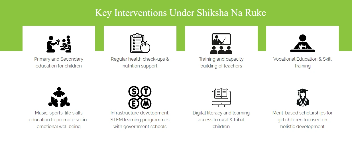
When you’re transparent, you build the most loyal audience. Reflect on how each donation is used and invested. Have a separate page linked to the main donation page that provides utility details. If you want an answer to what makes donation pages successful, it’s transparency. Have an open statement or have the facility to request a statement at any time.
9. Create a Dedicated Donor Wall
Creating a donor wall will build social proof and give the donors a sense of pride. They will feel belonged to the community and will happily take part in all the activities. Donor’s wall will also encourage other users to contribute. Real people, real feedback, and a point of contact will increase the trust in visiting people.10. Use of Images
Images are stronger than words. It would convey a feeling better than any words. If you write ‘Terror-attacked children’ and show a real picture of such children, which would draw in more eyes? Definitely the picture, right? Thus, you can use the strength of images to convey a message and story. Emotional stories are better told with images.11. Event List
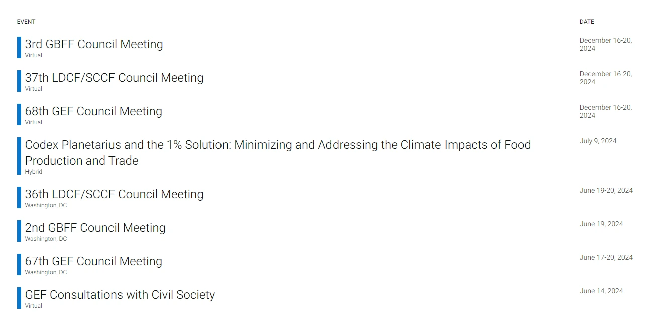
If you are having regular meetups for donors, online fundraising campaigns, or events to showcase the result of donations, then have it on your event list. With this, the donors would know how they can be involved further with your organization. This is to show them the value you have for your donors.
12. Thank You Page
Your donation form must redirect to a Thank You page after successful donations. Without donors, it would become tough for you to keep going ahead with your activities. So make sure you are reflecting your gratitude through a thank you message.Highlight the Tax Effective Giving
Let’s be honest and practical. Many people would donate to Nonprofits only because it will help them with tax deductions. In the U.S., donations to non-profit organizations coming under 501(c)(3) are tax-deductible. This increases the willingness to donate among many citizens. Highlight the tax benefits and the amount at which a user can receive such benefits. Having a tax-effective design increases motivation in one-time as well as recurring payers.
Add details on providing receipts for tax purposes. You can also offer an in-built calculator so that donors can calculate and estimate their tax savings based on the donation amount. This will attract high-net-worth individuals and giant corporations.
How to Create a Donation Page and Enable Donation Forms
You can opt for a donation platform like doublethedonation, donorbox, Wild Apricot or create your own donation page. If you are running a website, you can simply create a donation form with the help of the ARForms plugin. It comes with built-in payment gateways and a pop-up builder. The live editor with an intuitive drag-and-drop builder eases your form creation tasks. Choose from multiple templates and get going quickly. You can even find multiple donation page templates online to reuse.
12+ Donation Page Examples for Fundraising
We shall now look at some of the exclusive fundraising landing page examples. These inspiring donation page examples will help you kickstart your page design effectively.
- Code for America
- I9 Sports
- Giving Tree Books
- SCCF
- WWF
- Obama
- Give Foundation
- Smile Foundation
- Feeding America
- St. Jude Children’s Research Hospital
- Habitat for Humanity International
- Compassion International
- People for Animals
Wrapping Up the Donation Page Examples and Key Takeaways
Whether you are running an NGO membership website or an organizational website, you must consider these points before designing. And did you know there’s one more important thing? Having all your important information in just one fold. That means, having the most crucial information on a single screen so that it is visible without needing to scroll. This will enhance the user experience seamlessly.
Take inspiration from the list of NGOs and observe the way they’ve put information. You do not need to have it all but find your box of perfection to go ahead.
Read These also:
