Best Contact Us Page Examples you Have to See
A Contact Us page or a website contact form is vital information. It acts as a touchpoint between a business and the visitors. It is not just for formality, but a bridge to foster communication. On top of it, when you present your accurate contact information, you build trust and strengthen relationships. You provide a space to reach out to you in difficulty.
A Contact Us page proves to be a point of conversion as well. Once you simplify the process of reaching out to you, you enhance user experience. It includes your business address, email address, various calls to action, contact form, and social media handles, among other information. Along with the benefits of creating a contact page, you will also get to see Contact Us page template for easy recreation for your business.
The Contact Us page serves as a gateway for someone to transform from a visitor to a customer. If your page provides proper information and is user-friendly, then it will enhance visitor’s trust and experience. When you show that your business is open to multiple inquiries and feedback, you increase credibility.
Without a well-structured Contact Us page design, your business would fail to look professional. This page is for showing the value of communication, responsiveness, and transparency in business functions. Only this page would provide a platform to potential clients for inquiry, thus, forwarding to lead generation. A Contact Us page is an opportunity you should capture for serving customers and helping them down the sales funnel.
To create the best contact forms, you must consider the following elements to include in it. This will guide you to design a responsive Contact Us page.
Along with the Contact Form, the site of WWF also gives various contact information on their page for a direct point of contact. Being an organization having diverse activities, it provides different information for each, thus, easing the load on a single contact handler.
Look at the virtual tour section of Harvard. It connects the audience with you and they feel involved.

BookingPress is a great example of this. It provides a contact form and allows a customer to select the type of query. Apart from that, the site has a live chat option to solve queries quickly.
Note down and implement these contact form best practices for better user experience. Now, we shall look at some of the best contact forms to understand effective ways to design a Contact Us page.
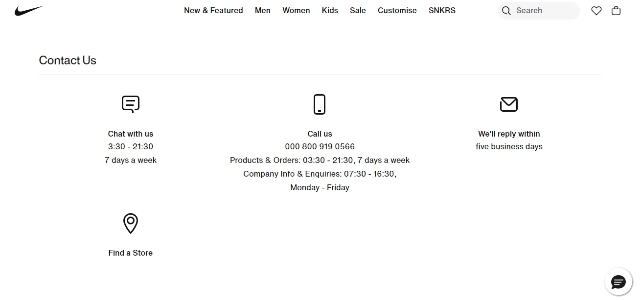
I would have loved to see some images in the background or foreground that connect with the brand. Nike being a sporty company, the contact us page looks a little bland to me.
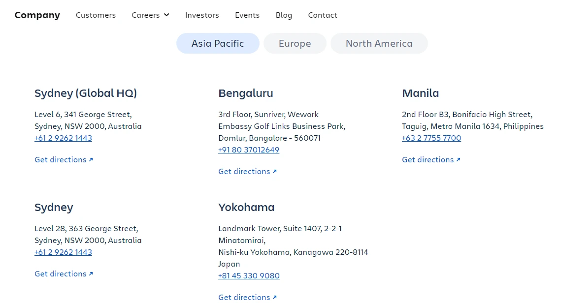
On scrolling ahead, it has a section of Our Offices around the World that lists the location, mentions the contact information and addresses for each, and links to Maps for directions. This is one of the best Contact Us page suggestions that you can learn from. Simple, Chic, Straightforward, and Well-designed.
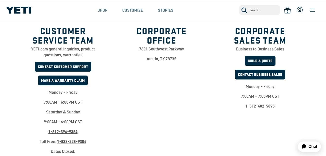
On scrolling further, it provides details about the customer service team, corporate office, and corporate sales team. It reflects transparency by displaying their active days and times. The best part, it provides a list of their Holiday’s when the Customer Service team will not be available. Genius designing!
When you wonder about what type of information is on the Contact Us page, you need to just do two things. Refer to the 7 Key Elements and make a note. Secondly, observe how other businesses are inculcating these features. Observing and learning is the best way to do the right thing. Check what attracts you the most or what makes you stop and look. Note down those bits of information and get going.
In the digital era, if you have an online business, you must be easily reachable through various modes of communication. Period. Real faces, real information, and verifiable data lay down a strong trust in the world where it has become very easy to run digital scams. Your business should not be counted as one, thus follow the instructions of this Blog. Until next time, toodless!
Read This Also:
A Contact Us page proves to be a point of conversion as well. Once you simplify the process of reaching out to you, you enhance user experience. It includes your business address, email address, various calls to action, contact form, and social media handles, among other information. Along with the benefits of creating a contact page, you will also get to see Contact Us page template for easy recreation for your business.
Why Your Contact Us Page Matters for Lead Generation
The Contact Us page serves as a gateway for someone to transform from a visitor to a customer. If your page provides proper information and is user-friendly, then it will enhance visitor’s trust and experience. When you show that your business is open to multiple inquiries and feedback, you increase credibility.
Without a well-structured Contact Us page design, your business would fail to look professional. This page is for showing the value of communication, responsiveness, and transparency in business functions. Only this page would provide a platform to potential clients for inquiry, thus, forwarding to lead generation. A Contact Us page is an opportunity you should capture for serving customers and helping them down the sales funnel.
- Ease the Customer experience by providing them with a direct channel for support, more information, or submitting feedback
- Reduce customer frustration by giving clear CTAs and multiple single-click contact options. This will make them more likely to engage.
- Enable lead generation with a contact form to capture customer data. Collect names, email addresses, pain points, and the nature of the inquiry.
- Close deals and nurture leads by funneling these inquiries into the customer service pipeline and keep following up.
What Should You Have on a Contact Us Page (Key Elements)
To create the best contact forms, you must consider the following elements to include in it. This will guide you to design a responsive Contact Us page.
1. Clear and Concise Forms
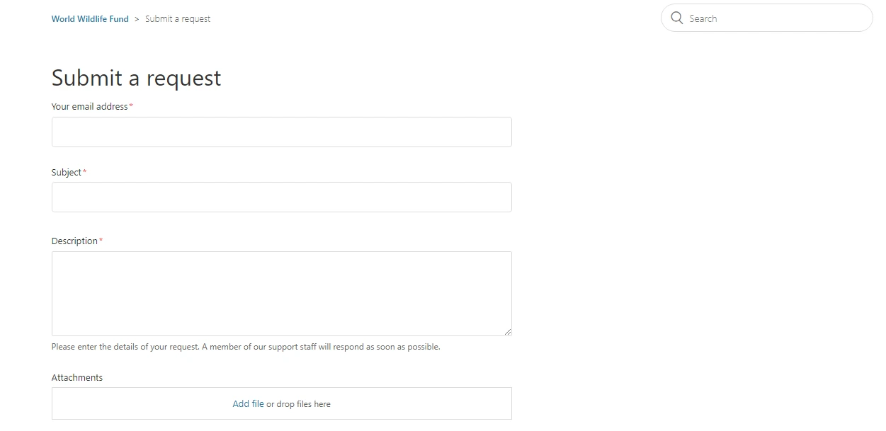
Filling too many boxes is an irritating experience for most of us. Avoid spreading this feeling to your potential customers by keeping it clear, short, and straightforward. Overcomplicated forms with heavy language can lead to high abandonment rates. Look at how WWF has put only three compulsory info boxes and provided one for attachments, if any. It is very simple in design and conveys the purpose strongly.
2. Visible Contact Information
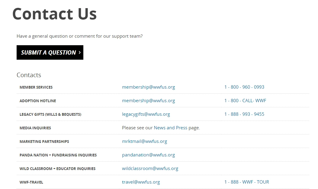
Well, what if someone does not want the hassle of filling up the contact form and waiting for your response? What if they want to reach out to you directly? In this case, having all the important points of contact listed well on your contact page helps. Add details like phone numbers, email addresses, physical location addresses, and social media links. With ARForms, you can even include third-party links like Google Maps.Along with the Contact Form, the site of WWF also gives various contact information on their page for a direct point of contact. Being an organization having diverse activities, it provides different information for each, thus, easing the load on a single contact handler.

3. Interactive Elements like Maps or Videos
If you want to engage your visitors on the Contact Us page, add elements like videos. If you have a physical location, adding a Google Maps location will enhance your reachability. A virtual tour also attracts visitors. If your location is of importance in your business, for instance, a University, an Organization hiring Employees, or a Recreation or Luxury center, this would be helpful.Look at the virtual tour section of Harvard. It connects the audience with you and they feel involved.

4. Multiple Contact Options (Form, Email, Phone, Chat)
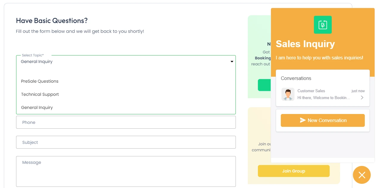
Everyone will have a different concern and prefer different modes of communication. Some would want a live chat to have a quick solution while others are okay with email. Some would not prefer texting in any form and would be comfortable talking with a human over a call. Thus, you must provide various contact options based on your industry.BookingPress is a great example of this. It provides a contact form and allows a customer to select the type of query. Apart from that, the site has a live chat option to solve queries quickly.

5. Branding and Visual Design Consistency
Branding and Visual Design play a crucial role in communicating your business. Your logo, brand colors, and language should be consistent across the website. It reflects strong branding and professionalism.6. Transparency
Trust is the fuel on which your business would run thousands of miles. Thus, your Contact Us page should reflect transparency. This can be achieved by including team photos and a link to ‘life on your company page’. You can also include details of expected response time and set clear expectations. This would be more appreciated than conveying the feeling of being ghosted. Transparency fosters a positive business-customer relationship.7. Accessibility and Mobile Responsiveness
A contact form should look decent on all devices from a desktop to mobile, tablet, and laptop. Make sure the WordPress theme that you choose provides this feature. The CTA buttons and forms must be accessible even on a mobile device. Do a proper site check to understand whether it is responsive and accessible or not.Note down and implement these contact form best practices for better user experience. Now, we shall look at some of the best contact forms to understand effective ways to design a Contact Us page.
Best Examples of Contact Us Pages
1. Pixpa
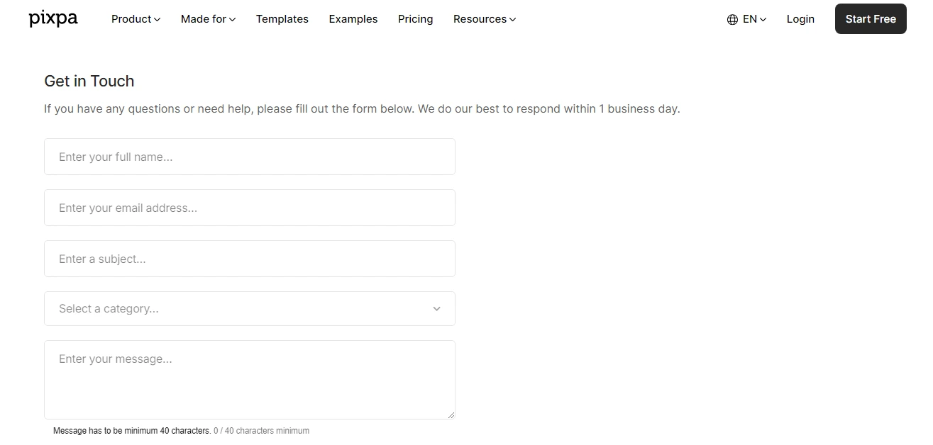
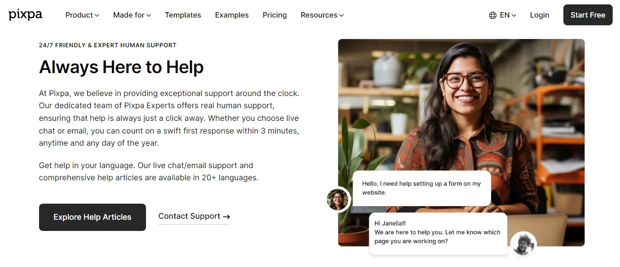
Pixpa uses a very clean design for its Contact Us page. It provides an easy-to-understand form. On scrolling further, it also provides Chat Support to talk with a human directly. The best part here is the link to their articles. It drives traffic to their articles and also solves queries on the spot without investing support time and energy for general queries.

2. Accenture
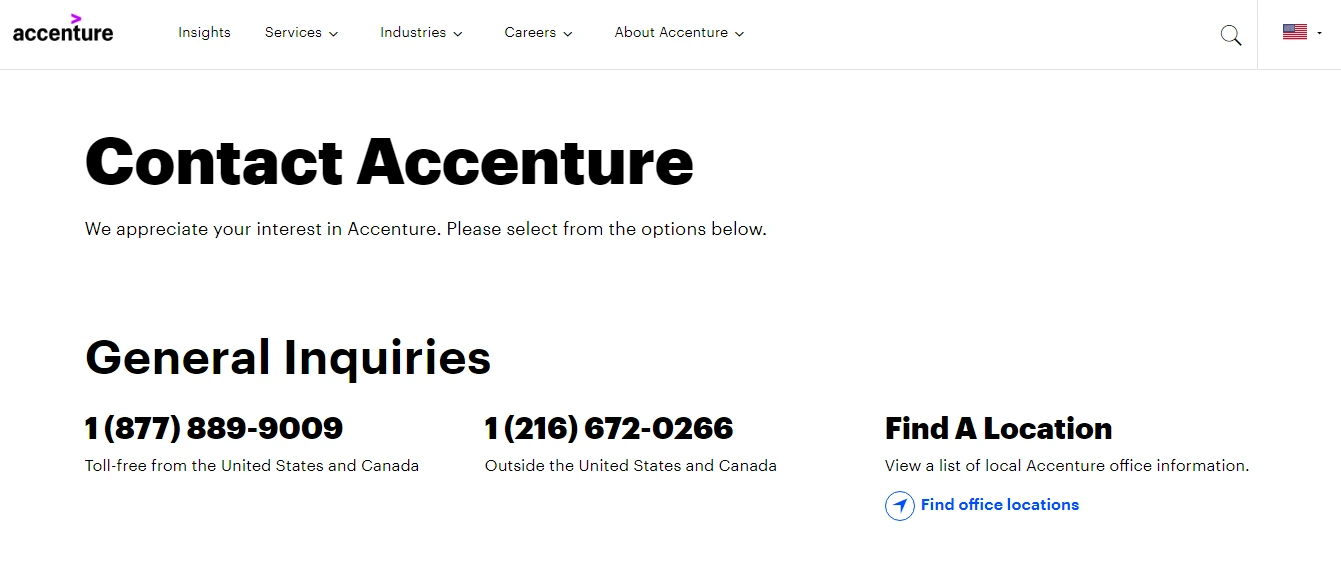
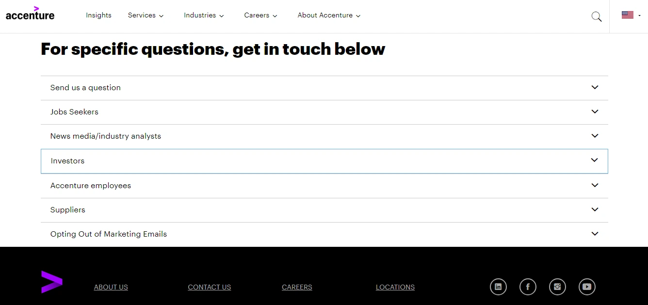
This multinational company offers different ways of contacting them. Initially, it provides contact numbers based on region and country for General Inquiries. Further, it gives a list of inquiries that an individual might have. The downward arrow either presents a contact form to be filled for inquiry or dedicated contact information. Herein, you can also find an office location near you. Thus, this sample Contact Us page of Accenture incorporates all the Key Elements.

3. People Metrics
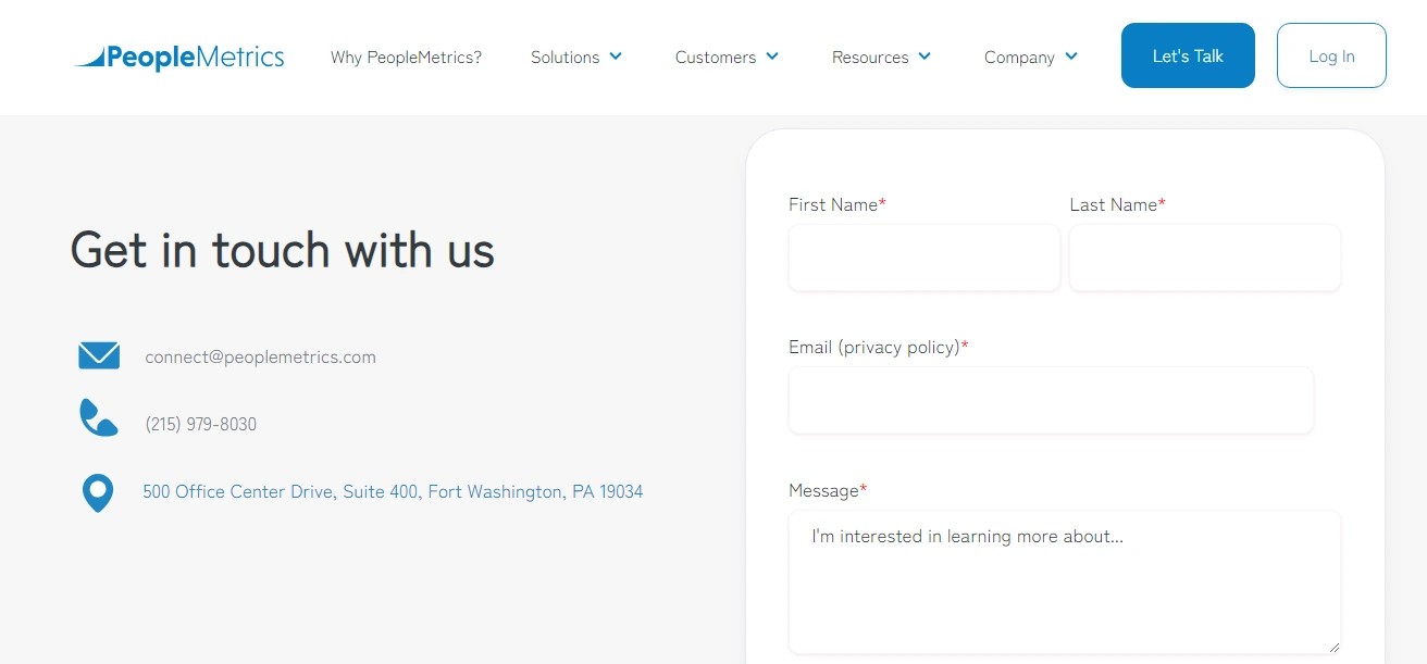
People Metrics is a platform supporting research. Its contact page is clear, concise, and easy to interact with. It provides an Email Address, Phone Number, and Physical Address. All this information is hyperlinked and a visitor can directly click and get in touch. Further, it also has a contact form to reach out directly with a specific query.
4. Nike
Nike has a very plain Contact Us page listing all the essential information. I like how it has a chat pop-up if a person opts for the ‘Chat with Us’ section and Call Us option as well. Further, they are transparent in their response time so that a customer knows that they have to wait and not be disappointed. This sets clear expectations. It also helps you find a store anywhere.I would have loved to see some images in the background or foreground that connect with the brand. Nike being a sporty company, the contact us page looks a little bland to me.

5. Atlassian
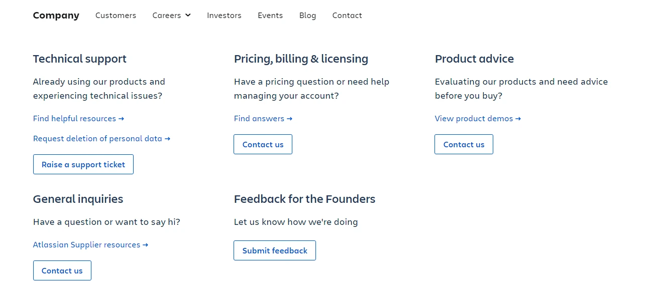
The Contact Us page of Atlassian features images of real people in its banner that directly trigger human emotions. Further, it segregates the various types of queries so that a visitor is redirected to the right team and person.On scrolling ahead, it has a section of Our Offices around the World that lists the location, mentions the contact information and addresses for each, and links to Maps for directions. This is one of the best Contact Us page suggestions that you can learn from. Simple, Chic, Straightforward, and Well-designed.


6. Yeti
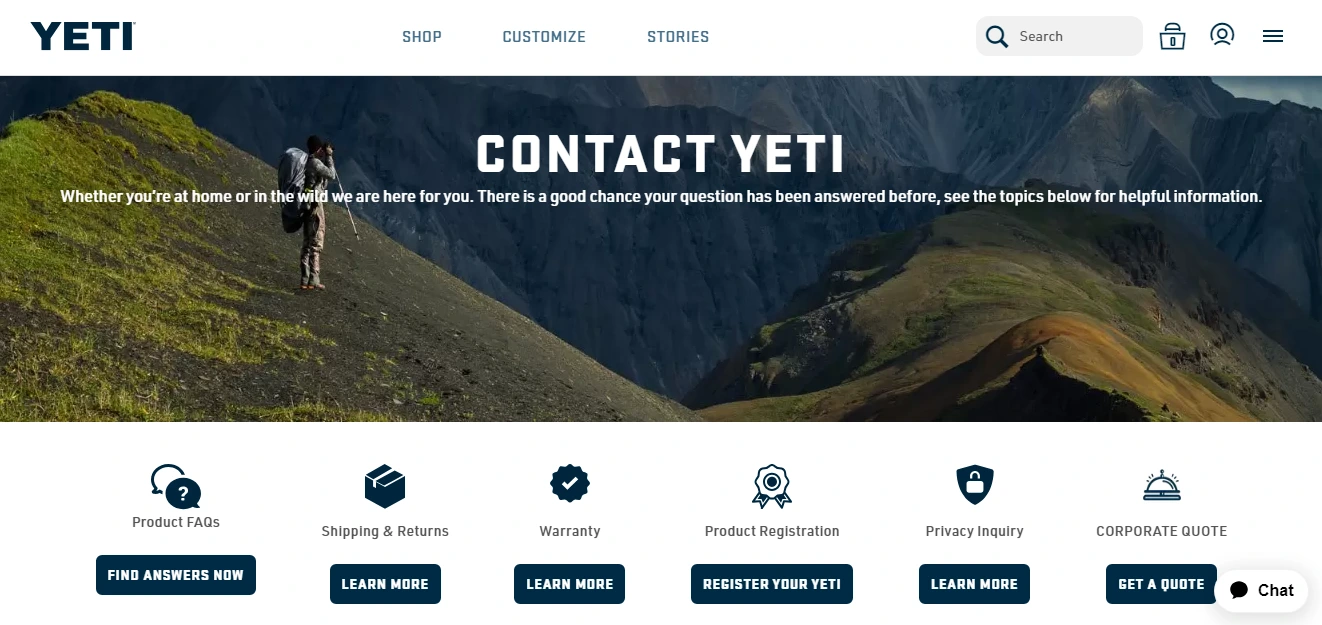
Yeti is another such beautiful example of a Contact Us page. It uses images, icons, and bolder fonts to attract visitors. Initially, it provides a list of basic inquiries and questions with the help of icons. It also fashions a live chat box on the bottom-right side.On scrolling further, it provides details about the customer service team, corporate office, and corporate sales team. It reflects transparency by displaying their active days and times. The best part, it provides a list of their Holiday’s when the Customer Service team will not be available. Genius designing!


Wrapping Up the Contact Us Page Guide with Examples
When you wonder about what type of information is on the Contact Us page, you need to just do two things. Refer to the 7 Key Elements and make a note. Secondly, observe how other businesses are inculcating these features. Observing and learning is the best way to do the right thing. Check what attracts you the most or what makes you stop and look. Note down those bits of information and get going.
In the digital era, if you have an online business, you must be easily reachable through various modes of communication. Period. Real faces, real information, and verifiable data lay down a strong trust in the world where it has become very easy to run digital scams. Your business should not be counted as one, thus follow the instructions of this Blog. Until next time, toodless!
Read This Also:

