How To Avoid Common Mistake When You Using Form Plugins
Around 63% of businesses report that they face difficulty in generating leads and getting desired traffic. A form is something that would help you solve this issue. How? Well, its strategic use and placement can convert a visitor to a lead, and eventually a customer.
Forms facilitate communication between you and your Website visitors. Its utility is multi-faceted including collecting contact details, receiving feedback, or adding them to your mail list. No matter how seasoned you are, there are certain mistakes in form building that you are bound to make at some or the other time. Before we delve into common contact form mistakes, let us see what kind of forms are generally created.
2) Value Proposition Forms: These forms offer something in exchange for the information you get. A newsletter, a guide, an e-book, or specific gated assets.
3) Pop-Up Forms: Just as the name suggests, this kind of a form pops up at a certain place to catch users attention. It can be a sale or discount notification with a redirection to Purchase Section with a ‘Get Now’ or ‘Shop Now’ option.
1) Enhanced User Interaction: A direct way for users to interact, raising queries, and providing feedback.
2) Aids in Data Collection: Being a marketer, sometimes, you need to carry out audience research. A well-designed form will help you in the same and help maintain your data.
3) Automating Various Processes: There are many processes that can be automated like sales funnel, email marketing with the help of forms.
4) Lead Generation Tool: Get the leads of people who are interested in your offering and would like to explore your Website. Nurture these leads so that a maximum amount can be converted to customers.
5) Managing Event Sign-ups: If you are organizing any event, it is crucial for you to generate forms for sign ups, registration, payments. Having a form that will align with your event is crucial.

Creating Forms on WordPress site is much more than choosing a Plugin. You must avoid these common mistakes to keep your forms user-friendly. Regularly check if there are any issues faced by the users in filling up your form and update it accordingly.
ARForms can make your life smooth and easy to deal with forms on your Website. Check the free trial and get your site going.
Other Informative Blogs:
Forms facilitate communication between you and your Website visitors. Its utility is multi-faceted including collecting contact details, receiving feedback, or adding them to your mail list. No matter how seasoned you are, there are certain mistakes in form building that you are bound to make at some or the other time. Before we delve into common contact form mistakes, let us see what kind of forms are generally created.
Basic Types of Forms
1) Embedded Forms: These types of forms are the static forms that have a permanent place on your Website. For instance, a Comment Box at the end of each blog, or an inquiry form that you may put after About Us.2) Value Proposition Forms: These forms offer something in exchange for the information you get. A newsletter, a guide, an e-book, or specific gated assets.
3) Pop-Up Forms: Just as the name suggests, this kind of a form pops up at a certain place to catch users attention. It can be a sale or discount notification with a redirection to Purchase Section with a ‘Get Now’ or ‘Shop Now’ option.

Why Create Forms on a WordPress Site
WordPress has 62.7% share in the CMS market and is dominating it, and rightly so. It offers a wide range of Plugins that can enhance the functionality of your site, including form building Plugins for WordPress online forms. From audience communication to user engagement, the Form Builder Plugin has multiple benefits. Let us look at some of them right here.1) Enhanced User Interaction: A direct way for users to interact, raising queries, and providing feedback.
2) Aids in Data Collection: Being a marketer, sometimes, you need to carry out audience research. A well-designed form will help you in the same and help maintain your data.
3) Automating Various Processes: There are many processes that can be automated like sales funnel, email marketing with the help of forms.
4) Lead Generation Tool: Get the leads of people who are interested in your offering and would like to explore your Website. Nurture these leads so that a maximum amount can be converted to customers.
5) Managing Event Sign-ups: If you are organizing any event, it is crucial for you to generate forms for sign ups, registration, payments. Having a form that will align with your event is crucial.
Top Form Building Errors to Avoid
To create effective forms for WordPress, you need to study the errors that can compromise performance of a Website. Let’s get into it, one-by-one.1) Improper Color Scheme
A color scheme that might seem redundant, however, is a very crucial aspect of forms. You must not neglect it. It ensures readability and user engagement. Thus, choose color that are easy on the eyes and do not compromise on reading capacity.- Use Contrast: Ensure that there is enough contrast between the text and background color otherwise both will merge up for a weak readability.
- Stick to Your Brand: Color that align with your logo and brand identity must be utilized in some or the other form. However, do not over stuff it and keep it easy on the eyes.

2) Lengthy Forms
A user happily starts filling a form, however, if it doesn’t end in two-steps also, then they would just go away with their progress. Creating lengthy forms with unnecessary questions is the biggest contact form mistake that you can commit.- Use Multi-step Forms: Break down long forms into multiple steps to make them less overwhelming, however, when a user has to keep going Next after Next, they can get irritated. One step form or a two-step form is the best idea to start with.
- Keep It Short: Only ask for basic essential information.
- Progress Indicators: Form Progress indicators show users how much of the form is completed and how much is pending. This will encourage them to finish it even if it’s a multi-step form.
3) Lack of Confirmation Message
A confirmation message is crucial to reassure users that their form submission was successful. If this message is not received, they would be confused whether their response was recorded or not. They might fill the form again without the lack of confirmation thus, creating duplicates for you.- Add a Confirmation Page: Redirect users to a thank you page or a confirmation page after form submission.
- Email Confirmation: You can send an email confirmation to users after they submit the form. This can be done from the email settings of ARForms.
- On-page Messages: You can even opt for displaying a message on the same page after form submission.
4) Not Using Targeted Questions with Conditional Formatting
Did you know you can conditionally format your forms based on the field selection of the user. For instance, you are sharing a free financial guide copy to whoever is filling out a form. Now, you have bifurcated the guide based on the age and income level. So, you can conditionally format the form so that the further fields are shown as per their previous selection.- Use Conditional Logic: With conditional logic, you can show or hide questions based on the user’s responses to previous fields and create a custom form.
- Simplify the Form: The form appears to be shorter and more relevant to the user as it shows only the fields that are applicable to them.
- Personalize User Experience: A personalized feeling of form will make it more engaging, interesting, and effective to the users.
5) Not Checking Analytics
How your form and website perform is useful in getting insights regarding any changes that must be done in the strategy.- Use Form Analytics Tools: There are multiple free and paid analytics tools that can be explored based on the requirement. ARForms has built-in form analytics that can track performance.
- Monitor Key Metrics: Check the form completion rates, time taken to complete the form, and drop-off points to understand how users are interacting with your form.
- Optimize Based on Data: All the analytics data can help you modify your strategies and make improvements to your forms.
6) Non-optimization for Mobile
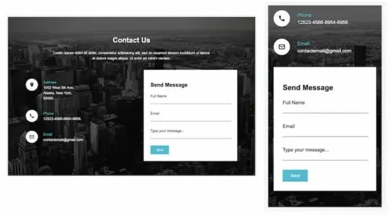
Around 96.3% access the internet via a mobile phone for their daily use, thus, it is quite crucial to optimize your site and have mobile-friendly forms.- Responsive Design: Use a form plugin which can adapt to all kinds of mobile devices. A responsive design that ensures your form looks good on all devices is the most basic necessity.
- Test on Multiple Devices: You must check your forms on multiple devices and screen sizes at regular intervals to ensure responsiveness.
- Simplify for Mobile: Use mobile-friendly input types like date pickers, drop-downs.

7) Not Using Simple Anti-Spam Features
Spam submissions can clog your database and even irritate users every time they need to enter a text or verify traffic signals.- CAPTCHA: Use CAPTCHA or reCAPTCHA to prevent automated spam submissions.
- Honeypot Fields: Add honeypot fields to trap spam bots without affecting user experience. Email Verification: Require email verification to ensure that the submissions are from real users.
- Use ARForms: ARForms has multiple in-built spam protection features that can save up a lot of your time and resources.
8) Accidental Deletion of Forms
When you create forms on a WordPress site, you might accidentally delete a form rule. If it happens, you are going to lose all your data. To avoid this,- Backup Regularly: Regularly backup your site and forms to prevent data loss.
- Confirmation Prompts: Use plugins that require confirmation before deleting forms and have a trash facility before you manually permanently delete from the trash.
- Version History: Opt for form plugins that offer version history or revision control.

Conclusion
Creating Forms on WordPress site is much more than choosing a Plugin. You must avoid these common mistakes to keep your forms user-friendly. Regularly check if there are any issues faced by the users in filling up your form and update it accordingly.
ARForms can make your life smooth and easy to deal with forms on your Website. Check the free trial and get your site going.
FAQs
1. How can I make my forms mobile-friendly?
Check the Plugin features before applying it on your site. It must have a responsive design. Further simplify your form fields and keep checking your forms on different devices.2. How can I analyze the performance of my forms?
Use Google Analytics or built-in form analytics to monitor important key metrics that heavily affect your performance.3. Can I Create a Unit Test with Forms?
If you are an academician and want to test your students, use a form builder to provide them with the test and record all your answers digitally. This is an increasing trend.Other Informative Blogs:
